New host???
What have I done! I decided to transfer my domain to another provider, but didn’t understand the process to export/import Wordpress files, so I’ve managed to get all my text but none of the pictures!
I am gonna take a long time finding the super old pictures, so maybe it’ll just be one of those things that will be lost in time, who knows!
Still gotta keep up my blog posts though, right???
Reine's Kitchen 2024
I think it's been a while since I've posted any cooking adventures, but this Christmas I had plenty of time to really treat myself to some fancy food!
I think it's been a while since I've posted any cooking adventures, but this Christmas I had plenty of time to really treat myself to some fancy food!
Ok, this cake was not something I made haha. This is my second ever whole cake purchase for just myself, a pistachio trifle cake from Teeter Bakery and it was amazing! I was worried it'd be too big for one person to finish, but I managed it over 3 days, which was pretty good!
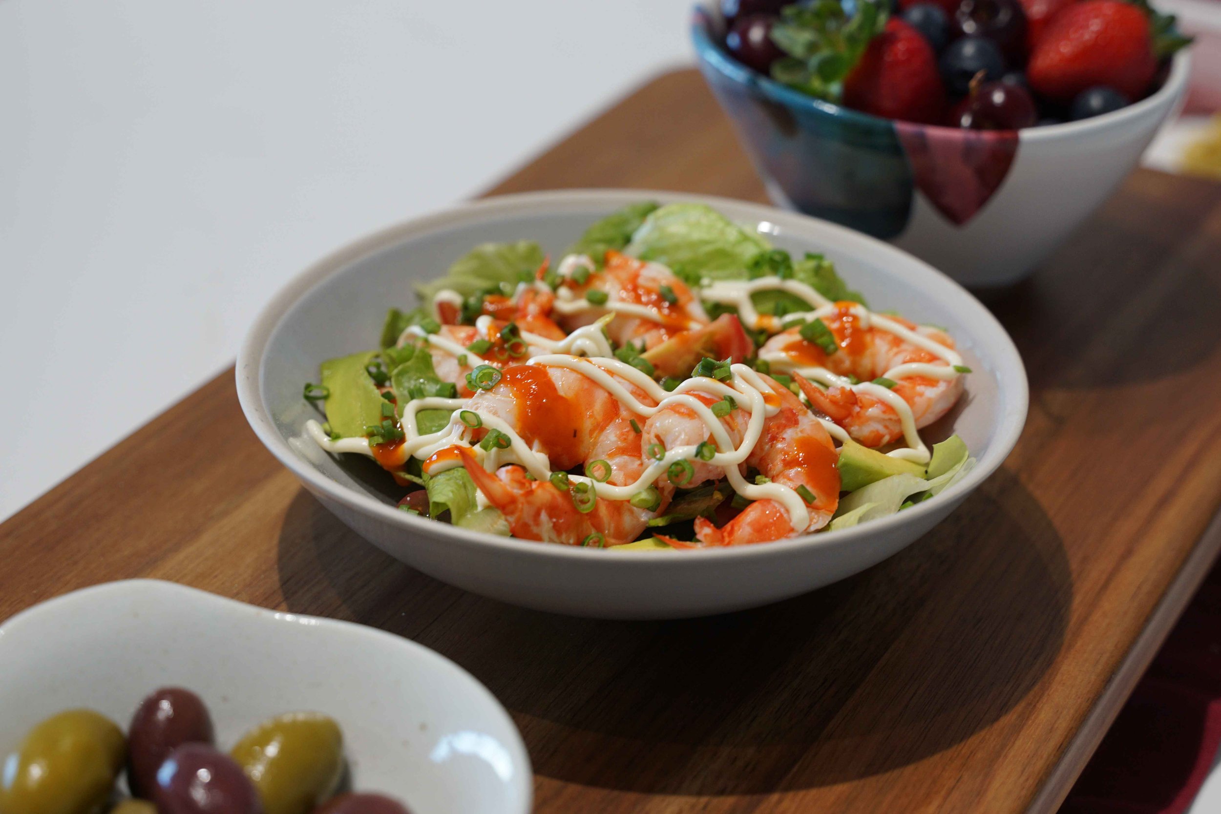
Christmas Eve spread included a trial of a caprese tower (which evolved to something way more epic on Christmas Day!), some sashimi, Big Don's Smoked Meats ham, berries and cherries galore, and a prawn salad - originally I wanted to make a prawn roll as well but I didn't manage to source brioche buns this time around and the salad was just as good!
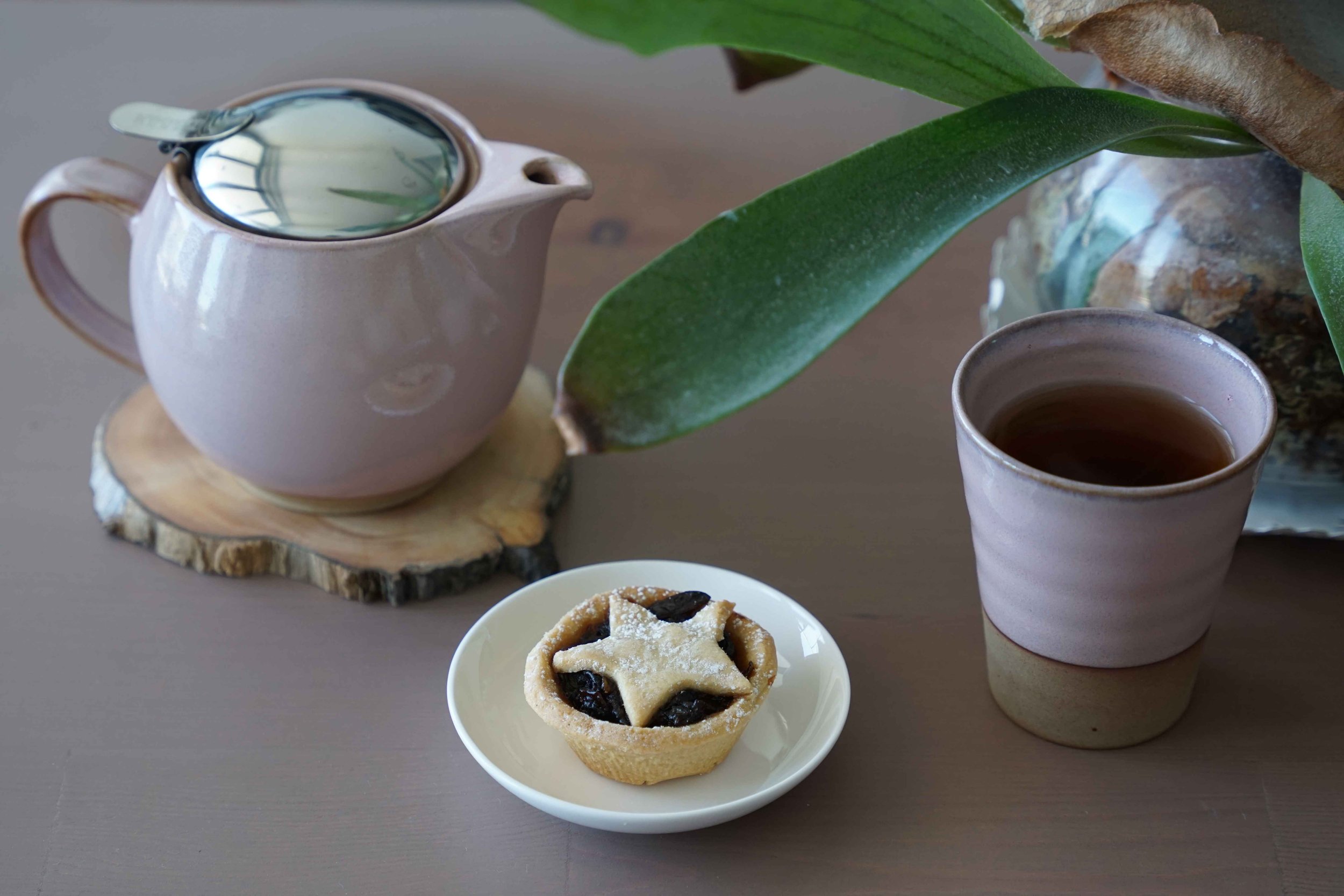
Also these fruit mince pies from Miller and Baker were great too! Turns out I am having a lot of trouble with my Japan Zero teapot; I can't pour it cleanly if it's got anymore than about 30% liquid in it, for some reason with my tilt it keeps coming out of the lid rather than just the spout? And if I tilt it less, nothing comes out. Still a conundrum!
And here is the epic caprese tower! It was a post by Poly that inspired me to try it, and I loved how ridiculous it looked, especially on my obnoxious plate!
Luckily my senses returned and my remaining tomatoes and burrata were plated normally!
And then for New Year's Eve and New Years I made my best chirashi yet! This time I got some sashimi, whereas previously I'd used just smoked salmon and some prawns as the seafood. Also, the tamagoyaki this year was really good too! I paid attention and used a brand new stainless steel pan which actually helped the egg glide smoothly! Who needs a non-stick pan dedicated to eggs XD
Another fun experiment was to try and make einspanners while Giant Coffee was closed. I used whipping cream, and only lightly whipped it, but it still came out too heavy. I am wondering if it's meant to be like half cream half milk as the secret? Who knows, I don't really need to continue researching the topic of lightly whipped cream since I have a cafe that does it better already!
I also found some mugwort mochi powder at the Japanese shop so I tried my hand at tri-colour dango. The pink ones were made with a raspberry and strawberry syrup I'd prepared earlier. Turns out that dango requires a mix of rice flour and glutinous rice flour, but I only had the glutinous type, which actually still turned out good but I suspect that the mix makes the dango lighter; my ones were quite dense compared to how the green ones turned out since that was a pre-mix. I also need to reduce the wetness of the dough; the mugwort balls were the most deformed because they had the highest water content, even though I tried to fix it by adding a bit more glutinous rice flour, but I guess I didn't add enough. This might be something I'll try again, but not sure!
New year's chirashi which used up the last of my sashimi :D
And lol, I had bought some sashimi grade scampi so I did some dumb things and made an abomination hand roll, which tasted really good!
And a cheese plate for lols. King Island black label brie, King Island Roaring Forties blue, and a red cheddar I found. I was actually after reypanaer but the shops didn't have any of the super aged stuff. I decided for the cheddar instead since I hadn't had it before and to my (dumb) surprise, it wasn't the flavour profile I was after haha. It tasted like cheddar when I was hoping for caramel and crystals! It was still good though, so I can't fault the cheese, just my poor life choices. Oh also, the black stuff is Kangaroo Island dried sticky figs - they were so good I was temtped to go back and buy more, but they're an expensive luxury item so I guess I can only search for and buy them once a year.
Merry Christmas Happy New Year!!!
Hades 2 early access
Spoilers ahead!
Ok, so I wasn't supposed to buy early access; I originally wanted to wait till full release and then take leave from work to binge on the game, but fate had other ideas. I one day accidentally opened Steam, then scrolled down the front page, accidentally saw a Hades 2 video, accidentally watched it, then accidentally purchased it...
Perfect timing though, the Christmas break was perfect for having a hardcore gaming session! First Windblown, now Hades 2! So epic, I haven't had a session like this in ages!
It's a bit difficult to compare Windblown to Hades 2 since they're about 6 months apart in regards to development, but my goodness Hades 2 has so. much. more. content!!! It's way more involved than original Hades, it's same same but very different - so enjoyable! It also turns out that almost 1000 hours in Dead Cells and a reply of Hades 1 way back when to achieve 32 heat really paid off; it was much easier to beat the game faster, which actually had an odd effect of making collecting materials for upgrades much more of a grind!
Anyways here are some victory screenshots including a personal best so far of 12 heat on Chronos:
Also, Prometheus is difficult. I found it extremely hard to increase the difficulty because he just sticks on you almost all the time, and I don't deal well with that without a shield (once I took 900 damage from just him!!). But, 4 Fear is good enough for now and I'll keep working on him until they release the final boss on the Surface.
And of course the romance! I started with Nemesis exclusively but then I decided Moros was pretty good looking too, so I expect that I'll get another trio romance! Leaving Dora for now cause shades aren't my thing XD
I can't wait to see what achievements they release when the game is done, cause that'll be another grind session to get them all!
Windblown early access
I never thought I'd decide to play any game early access. I'm gonna wait out Hades 2 for full release. However, one day I opened up Steam and there just happened to be a livestream of Windblown and I'm like here, take my money....
It's so much fun! It'll be interesting to see how the game changes over the next year! I am loving the different font sizes of cray yelling haha.
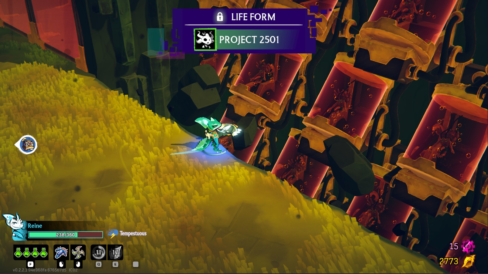
Now I'm finally on Cataclysmic difficulty! And I got what's apparently the rarest skin in the game so far, Project 2501!
Inversion Flow
It's been a long time since I've drawn! Trying a completely different technique and this went places; at first her face was too ashen and she reminded me of a vampire. I warmed up the skin a bit but mainly this was just an experiment of making some gold highlights pop.
Gotta get more ideas for drawing!!!


